FriedBot Studio - Crafting a Unique Brand Identity
The challenge was to create a distinctive logo and brand identity for FriedBot Studio, a tech company focused on self-healing software systems. The visual identity needed to represent their technical expertise and innovative approach while conveying their mission of resilience and revival.
We aimed to develop a design that would stand out in the competitive tech industry, effectively capturing the essence of FriedBot Studio’s cutting-edge, self-healing technology solutions. The identity also needed to be versatile across various platforms and applications.
Our Approach
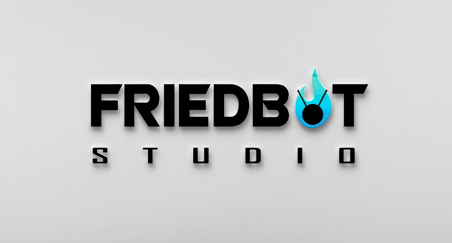
We began by understanding the core values and vision of FriedBot Studio. The name "FriedBot" is a clever play on a system that has become "fried" or rendered useless, paired with the idea of reviving it.
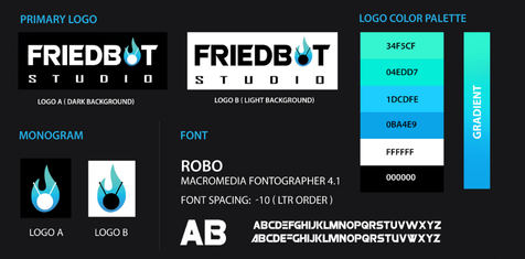
- Symbol: Represents revival within the 'O' of "BOT."
- Typography: Conveys brand strength and stability.
- Blue-Cyan Palette: Evokes innovation and trust.
- ROBO Font: Offers a sleek, futuristic look.
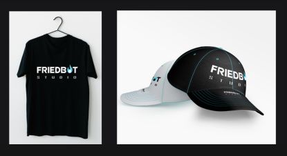
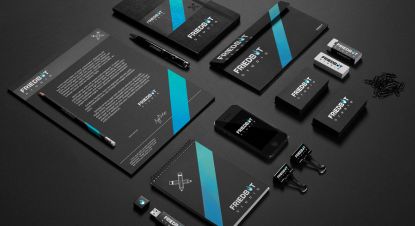
- Identity: Applied across all brand touchpoints.
- Versatile Design: Adapts seamlessly across mediums.
Our approach began with a deep understanding of FriedBot Studio’s core values and vision. We focused on the concept of revival and innovation, designing a logo and brand identity that visually represented resilience while ensuring consistency and versatility across all brand touchpoints and mediums.
The Outcome
The result was a cohesive and compelling brand identity that clearly communicates FriedBot Studio’s mission and values. The logo and branding elements effectively capture the essence of innovation and resilience.
Helping FriedBot Studio stand out in the competitive tech industry. The new brand identity has been well-received by both the client and their audience, establishing a strong foundation for its future growth.